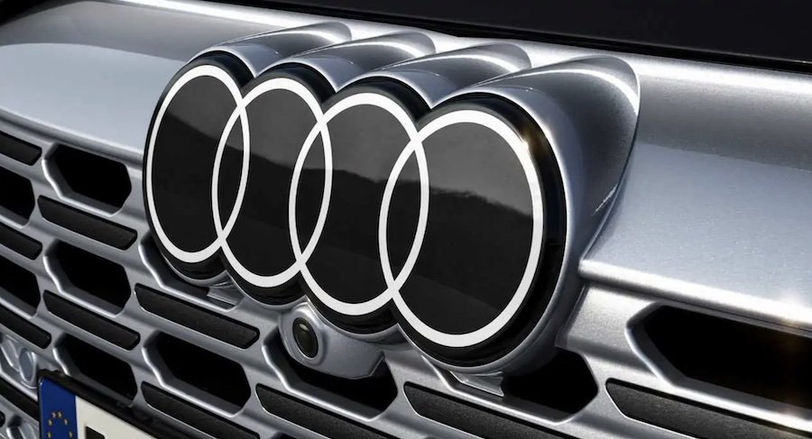
Audi's Iconic Four Rings Are Going 2D To Match the Brand's Vision for the Future

When you think of Audi, the four rings might pop into your mind – they're one of the critical identifiers of the Audi brand. To start the redesign process, Audi's team first had to investigate the logo's origin and how it evolved throughout the years. Back in 1932, four different automakers merged into the Auto Union – this served as an inspiration for the four interlaced rings. Later in 1965, Auto Union was rebranded into what we know today as Audi.
Audi stands for "Vorsprung durch Technik" - "Advancement through technology" would be the closest translation, as there's no exact English equivalent for "vorsprung." The company targets customers who value attention to detail and a qualitative design approach. It seeks to showcase its passion for innovation while remaining sophisticated and positioning itself as a progressive premium brand.
Audi's Brand Strategist Frederik Kalisch said, "There are really only two basic trends in brand presentation and product design today that express precisely this premium quality: That is, on the one hand, the loud and very bold, and on the other, the restrained, pure, and clean."
The purist approach matches Audi's philosophy. The manufacturer uses underlying substance and subtle identifying elements to win over customers, and now it's making this approach even more consistent. Every detail must project meaning or have a specific objective.
Nowadays, two-dimensional logos are the trend for auto manufacturers. In 2016, Audi's two-dimensional rings originated because of digitalization, when the brand wanted to depict the rings in a way that suited the medium.
However, fitting the two-dimensional logo on the outside of the vehicles first came up in 2019. It really took off in 2020 when the brand wanted to move the corporate identity from digital to actual cars. Basically, Audi wanted its iconic four rings to look the same anywhere you see it, whether on its vehicles, in a magazine, or on a smartphone.
So, what's changed? The redesign was an intense process. The new logo is free of chrome and instead features a high-contrast black-and-white look. The striking white pops out as it's embedded in a black glass body. It also brightens the logo and offers a flat and premium look – you can see it from far away, regardless of the car's paint or radiator grille color. What's changed is the graphic makeover, as the logo's geometry is very similar to the former ones.
Audi thinks it has found the "new chrome" - the black and white rings make the corporate identity unmistakable. If you're not into the new design, you can still opt for the rings in black. To be more precise, the variation uses dark gray instead of white.
In 2020, Audi's team reworked the brand strategy and corporate identity. This led to a new vehicle identification strategy to match the new brand. Audi has also standardized the fonts in and on the vehicle. In the future, Audi will only use its unique font, the "Audi Type."
The B-pillar now serves as the detailed model, derivative, and technology identifier for the brand. It boasts an identical design across all vehicles – specifically, two parts in high-gloss black. It's always in the passengers' field of view when entering and exiting the car.
André Georgi, designer and leader of Audi's Interface team, said, "Identification and vehicle design now act as a unit that aligns with Audi's new brand positioning."


