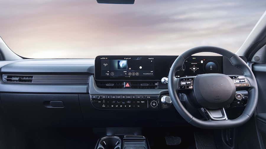
Hyundai Is Bringing Back Buttons Because Touchscreens Are ‘Annoying’

Hyundai is slowly backing away from the all-screen approach to interior design. Hyundai Design North America Vice President Ha Hak-soo said that people "get stressed, annoyed and steamed when they want to control something in a pinch but are unable to do so."
Screens inside new cars are better than ever. They’re huge, they have great resolution and the software behind them is usually snappy and well thought out. But after years of shoving what are essentially TVs on dashboards, it turns out that people don’t really like dealing with them, especially if accessing often-used features like climate control or volume settings means digging through menus on a screen while driving.
That’s dangerous, but it’s also very annoying, as Hyundai Design North America (HDNA) found out through the magic of focus groups. That’s why the Korean automaker is looking to bring back old-fashioned buttons in upcoming cars. The facelifted Ioniq 5 already has a redesigned HVAC control panel, but more are in the pipeline.
“As we were adding integrated [infotainment] screens in our vehicles, we also tried putting touchscreen-based controls, and people didn’t prefer that,” said HDNA Vice President Ha Hak-soo in a recent interview with Korea JoongAng Daily.
The reason why Hyundai–like other automakers–went down the all-touchscreen path was initially due to the “wow” factor of Telsa’s large multimedia systems. The Korean automaker even went as far as putting two touchscreens on the steering wheel of a concept back in 2019. Ultimately, though, Hyundai changed its mind and is now slowly reversing course.
“When we tested with our focus group, we realized that people get stressed, annoyed and steamed when they want to control something in a pinch but are unable to do so,” Ha said.
For a good number of years, car journalists, enthusiasts and industry experts have sounded the alarm for automakers to stop with the touchscreen controls. More recently, The European New Car Assesment Progamme, better known as Euro NCAP, which performs crash testing and issues a star-based safety rating, entered the discussion with a more serious tone. in simple terms, the organization said that beginning in 2026, automakers will have to fit physical buttons for certain functions if they want to get a five-star rating, the highest possible. That’s in addition to the usual active and passive safety features like airbags and automatic emergency braking.
It’s cool having a big screen–or even several screens–inside a car. It’s even a pretty well-disguised cost-cutting measure, despite few automakers admitting it. But it’s really distracting to have to go through a menu or a slide-out bar to change the temperature or skip the current song. With a simple physical button or knob–and no, those shiny haptic surfaces aren’t the same thing–you can just reach out and do what you want without even looking.
At the same time, we do know Hyundai is working on more advanced displays that span the entire windshield of the car and operate largely on voice controls. The automaker said we might even see a mass-production model with that technology as early as 2027. But perhaps there's room for both: buttons, but also more displays right in the driver's line of sight rather than a screen that turns them away from the road.
That, or Hyundai's just hedging its bets here. Either way, the next few years will be quite interesting when it comes to the in-car user experience.
Nouvelles connexes


