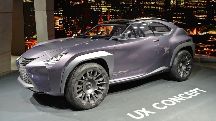
Lexus UX Concept represents a bold crossover future

And oh yeah, it's really weird. The UX is a concept in its truest form, from the bizarre wheel/tire combo to the "inside-out" design concept, the latter which reminds of Wonko the Sane from So Long and Thanks for All the Fish.
Designed by Lexus' studio in southern France, we aren't even really sure how to describe the design features of the UX. The sharp and angular exterior bleeds in and out of equally strange cabin seamlessly. But more than the body's creases and cuts, it's the general shape of the UX that's most interesting – this is a compact crossover, but it looks more like a jacked-up shooting brake than a typical two-box CUV.
The rear doors seemingly bleed into the aggressively raked C-pillar, while the long hood give the UX a more sporting character than most cars in this segment. At the same time, Lexus went out of its way to deemphasize the UX's sporty traits – square, off-road-like wheel arches contrast the strong front fenders that bulge up and above the hood, for example. The fact that designers painted these arches silver to contrast with the lovely amethyst paint gives them an even greater visual weight. Lexus says the overall idea for the silver accents – the wheel arches, mirrors, and roof rails – "represent a form of continuous yet interrupted bone structure." Whatever you say, guys.
But the wheels and tires represent the strangest visual detail. The 21-inch wheels actually extend into the tires. Lexus says it used laser carving to cut into the tire sidewalls, and then integrated the wheel spokes into rubber. The visual effect reminds us of those weird airless tires that pop up every few years.
The interior, meanwhile, implements Lexus' Kinetic Seat Concept for the first time. Believe it or not, the futuristic seats are the most insignificant part of the cabin. See, UX, in tech circles, is short for user experience. With a name like that, we expect big changes to the driving experience, and that's what Lexus delivers – from the swooping, overlapping dash that creates a real sense of depth from the driver's seat to the three-dimensional effect of the cabin's three displays, the cabin is a fascinating place. Of all the "deconstructed" styling elements Lexus implemented on the UX, we like the design of the dash the most.
It's unclear what role the UX Concept will have on future Lexus vehicles – the company says it's a vision of a future compact SUV, but the reality is that there's way too much design evolution here to limit to a single vehicle. It's a virtual certainty the UX will have a major impact on the company's coming products.


Nouvelles connexes


