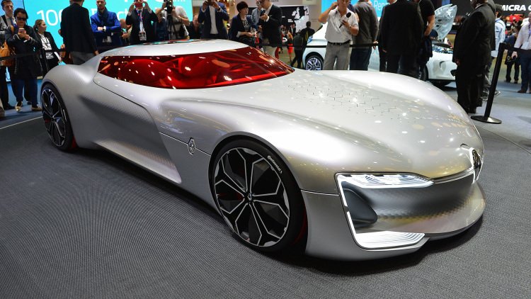
The Renault Trezor concept is a French design beauty

This is a pure concept, with some wild gimmicks and exaggerated proportions. Like all great concepts, however, it also is a glimpse at where Renault is going – and where Renault goes, corporate partner Nissan is likely coming along for the ride.
As a styling exercise, though, the Trezor is very, very French. It's long, elegant, and bold, with a striking red interior. Like the best concept cars, it has little to do with reality other than evolving Renault's styling direction. Consider the cheek pouch ducts, which exaggerates the same element in other contemporary Renaults to a cartoonish level.
The fun stuff is found on, not under, the hood. There's a grid of hexagonal openings, air intakes we're told, that pop open when needed (and presumably not when it's raining). The effect was striking, if impractical. Aerodynamic engineer types would likely point out that a NACA duct would be a better way to do that, but their shape doesn't match the overall hexagonal theme.
Other neat party tricks abound, like the canopy which hinges open like a George Barris-inspired Hot Wheels car. Another interesting touch is the exterior lighting, which changes to indicate to those around it that it's in fully-autonomous mode. We're seeing more automakers playing with exterior signals or symbology to communicate with passersby, although this seems to offer less tangible benefits. Even so, it's obvious the designers got to run wild with the Trezor, and it's complex enough to be a visual treat. Expect it to push other Renaults' styling further towards the avant garde moving forward, and give Nissan some ideas about where to take the GT-R in the driverless era to come.


Nouvelles connexes


