Rolls-Royce no longer sees itself as an automaker but instead as a "house of luxury." To fit this new identity, the company is reworking the branding to put forward a more modern message. The business wants to have greater appeal to younger customers because the average age of buyers is now just 43.
The famous Spirit of Ecstasy will have a greater role under the new branding plan. A simplified version of the female figure will appear on the company's products. The drawing will always face towards the right because this will apparently have her looking to the future.
"The use of the Spirit of Ecstasy marks a shift in the resonance of the brand – from an automotive to a lifestyle context," said Marina Willer, the leader of the revised brand identity. "She commands an aspirational quality in the luxury sphere and by placing her at the centre of the visual language. The Spirit of Ecstasy can now be interpreted as the muse for the marque, in addition to the motor cars themselves."
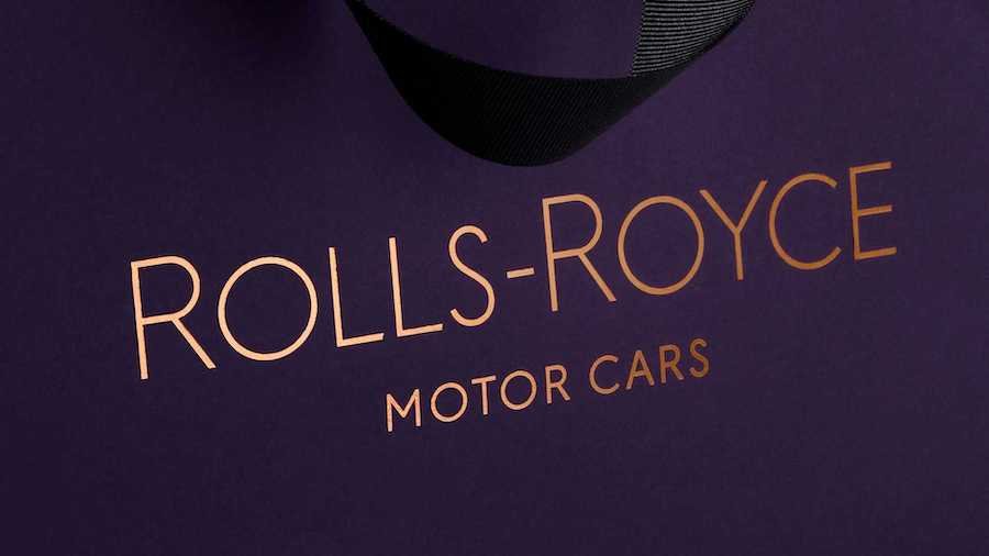
Rolls-Royce will also use a new signature color called Purple Spirit, and you'll often see it with a metallic shade of rose gold. The re-branding team believes these two hues communicate a sense of royalty and longevity, respectively.
The brand name will look a little different, too. It's now in the typeface Riviera Nights, which is similar to the previous Gil Sans Alt font. The letters now have more beveled edges, and the company also believes there's a greater emphasis on the letter "R" in Rolls and Royce.
One thing that's not changing is the double R monogram that represents founders Rolls and Royce. It was simply too iconic and linked to the company to change.
You'll start seeing the new look for Rolls-Royce's branding starting in September. This means it should have a prominent place on the new Ghost that debuts September 1.


Nouvelles connexes