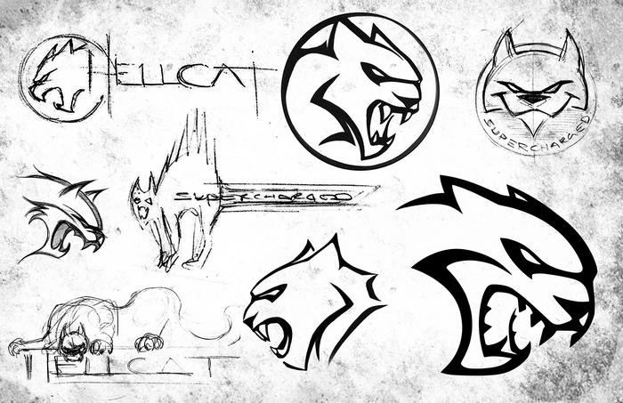
The Evolution of the Hellcat Logo

While most of the logos show aggressive, roaring Hellcats that are befitting of the beastly 707-hp engine, one took on a more playful theme.
The sketch in the upper right-hand corner shows a Hellcat with a mischievous grin that’s almost saying, “Yeah, I’m fast. Get in.”
The popular logo is a perfect example of how social media can drive the creative process for automakers. The early Challenger SRT Hellcat didn’t have the logo when it was first unveiled last May, but Dodge kept an eye on the social sphere and noticed that people loved it.
“People saw the logo and said, ‘This is awesome.’ It was originally just supposed to say ‘supercharged’ on the side of the car. But [the logo] got so much attention in social media that at the last minute, we changed from ‘supercharged’ to the actual logo on the car,” said Tim Kuniskis, Dodge brand CEO, in a recent interview.
“If you look at the cars that we had at the first press event, they didn’t have the logo on them. That was a very last-minute change all driven by feedback on social media.”
When Dodge revealed the Charger SRT Hellcat a few months later in August, it made sure to have the logo on the car. However, the early media photos Dodge released of the Charger also had the “supercharged” lettering instead of the Hellcat emblem.
Related News


