Earlier today, Nissan introduced the Ariya, a new all-electric crossover. It's part of Nissan's new plan to reinvigorate its lineup after several years of dismal sales. Nissan plans to launch 12 new vehicles in the next 18 months. To signal its new path, the company is also introducing new logos not only for the automaker itself but also for its performance brand Nismo.
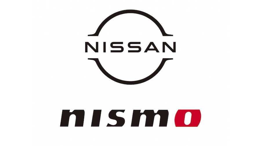
A hint that Nissan would update its logo with a new design emerged in March when the automaker filed trademarks for it around the world. Fast forward four months, and here's the new logo. Instead of the circular logo with the branding cutting through the middle, the new emblem opts for a semi-circle design with the Nissan letter floating in the middle.
The new design is flatter than the previous one, which is the most significant change between them. This is better suited for our digital world. Gone are the previous logo's skeuomorphic design elements – the shading, shadows, and highlights that make it appear like a 3D object in a 2D space, like a computer screen. The Nismo branding got a similar flattening in its design.
Nissan's new logo follows an emerging trend in the automotive industry. Last year, Volkswagen rolled out a new, flatter logo. VW introduced it to mark "the start of a new era" for the automaker. BMW did the same thing earlier this year, sharpening its iconic branding, though, on the cars themselves, the badges are still 3D.
It'll be interesting to see if other automakers follow this new trend as more and more people begin first encounter an automaker's brand online. Kia could be next with a new emblem, which could begin appearing on cars as soon as this October. For now, though, we have Nissan's new logo, which keeps the company name still at the center.
Related News