Today, the company is attempting to change that with the rollout of an entirely made-over version of its iOS application that introduces a cleaner, less-cluttered interface designed to simplify accessing Waze's key features, and speed up the time it takes to report traffic problems.
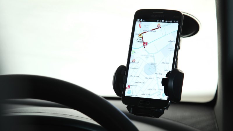
While traditional mapping applications, like those from Apple and Google, are still the most popular among smartphone users, Waze has a strong following among drivers and commuters thanks to its ability to alert you to traffic conditions. Beyond just telling you that traffic is slow, Waze can tell you why – maybe there's an accident ahead, or a stalled vehicle. Users also like it for its ability to alert you when cops have been spotted nearby – something that makes Waze something of an alternative to radar detectors.
Plus, its ability to route you around bad traffic in real-time as conditions change is especially helpful, as is its ability to let you add a stop while planning your route.
Today, Waze has over 50 million active users who log into Waze monthly, the company says.
But despite having a collection of useful features, the app's interface itself has needed work for some time. Instead of a modern, clean aesthetic, Waze previously relied on a couple of menus – one with a cartoon-ish car icon to access the main menu, and the other map pin-shaped icon with an exclamation point in the middle for reporting incidents. And the map itself was messy and cluttered, making it hard to read.